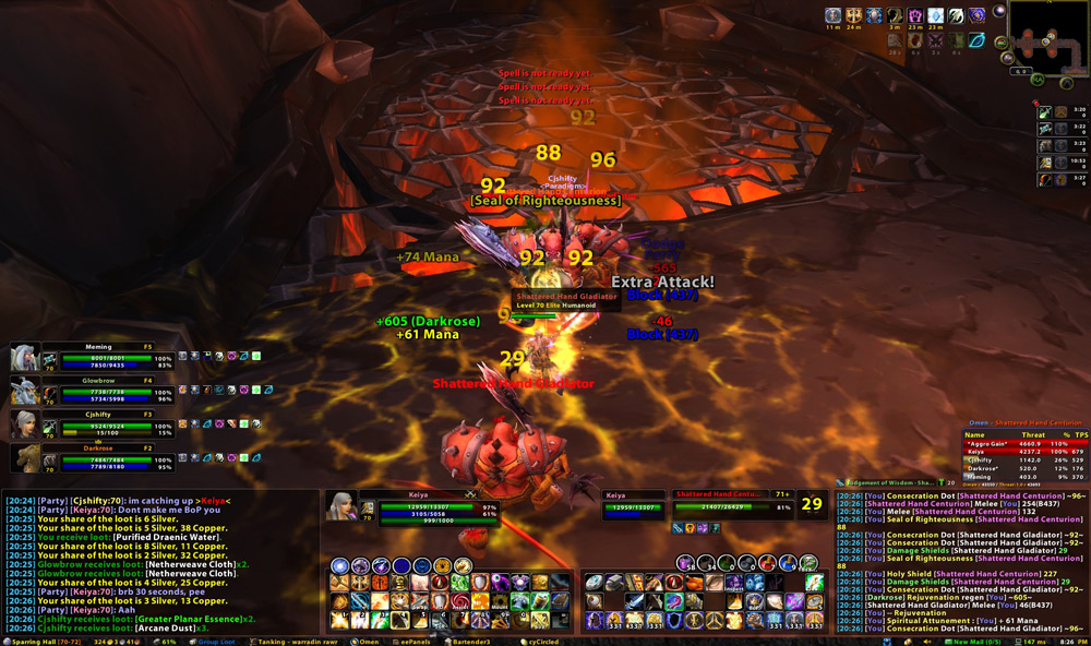
I browsed through many of the compilations at various UI sites but couldn’t find a good clean UI designed for widescreen monitors that suited my tastes (I’m unreasonably picky about certain things). So, I made my own and tinkering with it has been the object of my obsession for the past 2 days. I was going to jump on the, “100% Ace2” bandwagon, but ultimately I only really cared if a mod worked and suited my needs, rather than the piece of code it was based on/memory usage.
Other than relocating the targeting frames to the bottom of the screen, most of the layout isn’t all that different from the Blizzard default. Mostly, I just wanted to shrink the buttons down so that I could fit the chat and combat logs on either side. I liked the 2-column action bar layout, so I kept it that way and added a few extra rows of buttons. The logs are relatively tall, because I chat a lot and like them that way.
The stance bars are the circular buttons located on the top-left side of the action bar chunk; The pet bars are located directly above> Also added an additional set of unbound circular buttons docked to the top-right side of the action bars chunk. This is where I keep my potions, consumables, flasks, bandages, etc.
A lot of people like extremely simplistic targeting frames, but I don’t. The class icons, percentages, and numeric shit is useful for my healing purposes. Switched over from CTRaid to oRA2 + Perfect raid (sorted by group along the left side of the screen in one column, don’t have a good raid screenshot at the moment). The party frames are hidden and replaced with the PerfectRaid frames when in a raid group.
I tried both ag_UnitFrames and Pitbull but didn’t like either, so I stuck with Perl Classic. I had Elk’s BuffBar in the other screenshot, but disliked it (too big, among other things) and reverted back to the Blizzard default. It’s all fun and games until patch day arrives.

