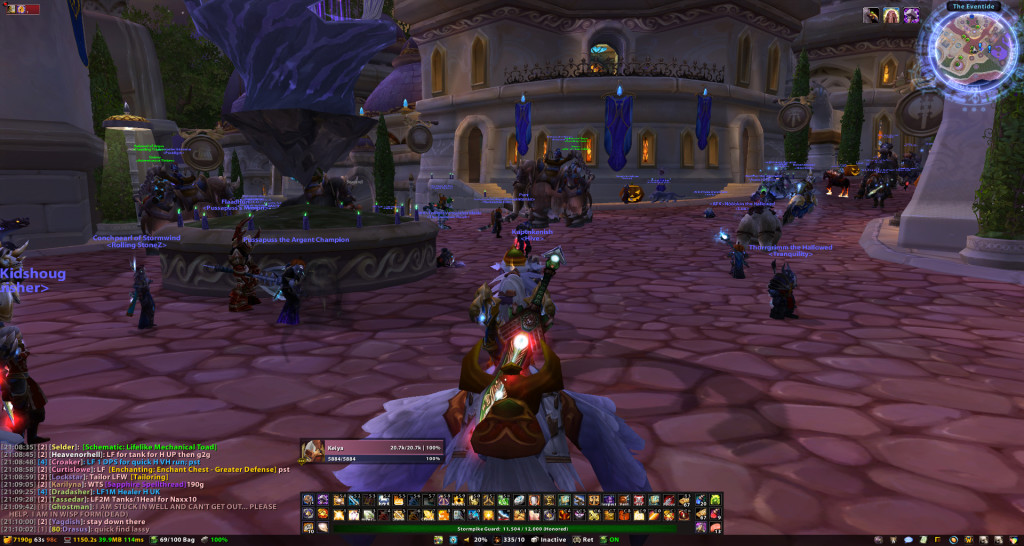
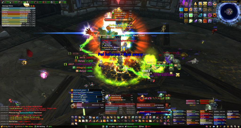
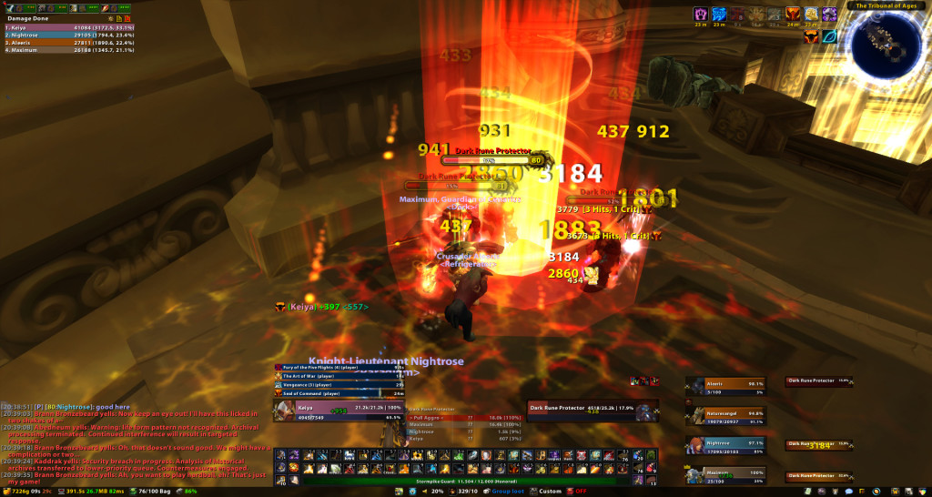
My UI goals this time around were more-or-less the same as any of my UI incarnations. First and foremost, I wanted to keep the center of my screen clear of all clutter, windows and bars. Other than the scrolling combat text on either side of the central box, there shouldn’t be a single thing obscuring my vision of the game. Per usual, any unused elements should automatically vanish or be hide-able when not in use. I strongly dislike layouts with the giant black bar of death across the entire lower third of the screen. It is not only a huge waste of space, but looks really weird when nothing is happening on screen.
4 sets of 12 buttons (48) is what I deemed minimally necessary to remain functional. I love my buttons and can’t really reduce it any further (previous UI versions had 6 sets). 3 of the bars are keybound to my n52te, the 4th being mostly used for random macros and stuff like that. There are two sets of 6 AutoBar buttons on either side of the Dominos bars. I didn’t like the little circular buttons in my previous setup so I moved them to the sides, making use of the wider screen.
- Left set: Blessings, Auras, BoP, Raid Wall Macro, DI, LoH.
- Right Set: Health Potions, Mana Potions, Healthstones, Crafting, Food Buffs, Water/Mage Food.
I’ve just conceded to the fact that my UI is probably never going to ever be clean and pretty looking mid-encounter no matter how hard I try. So this layout is as minimalistic as I could get it without sacrificing my precious windows and what have you. Actually, all I really did was shuffle a few mods around. It’s a necessary evil I guess, given that I am the raid leader and frequently a tank (I swear that some classes and roles have like, a total of 3 buttons on their screen and little else). Other than the focus frame and any pop-up range warning window from DBM, I think that this is probably the maximum level of crap that I would ever need to have on my screen at any given time.
I went back to the old school thick raid frames versus the skinny perfectraid style bars. Instead of being placed on the left edge of the screen, I have them shoved into the spot to the right of Dominos where Recount and Omen used to be. I am quite happy with this change; the 5 raid groups dock nicely into that spot, leaving the middle almost completely clear. I also moved the party and party target frames to this location.
Omen was moved front and center while recount was shoved in the corner. I wanted to do two things with this interface: one, make use of the gap between the player and target unitframes and two, drag Omen out of the corner into a more prominent position. So this takes care of both. And as far as recount goes, it’s happy over in the upper left corner. There’s really no reason, other than meterwhoring, why I need to or should have to stare at it during an active encounter. I’ve caught myself being a naughty retadin and Recount rubbernecking when I should have been looking for giant flaming balls of poo at my feet or something.
I went with Dominos (successor to Bongos) instead of Bartender 4 to move all of the interface elements around. It’s a lot easier to keybind and configure, though feature wise I’m not sure if I see much of a difference. But then again, my bar interface needs aren’t really all that exotic. Fubar was replaced with ChocolateBar since it is no longer being updated. I also extended it to cover the entire length of the screen instead of being limited to the small box in my previous UI incarnation. eePanels2 was replaced with kgPanels for the same reason.
Oh: I finally jumped on the Deadly Boss Mods train. There was a point when BigWigs was nicer because of the now defunct WoW Ace Updater compatibility as well as several other things that I don’t remember. I think Big Wigs is still updated more often, but I find the DBM indicators and bars more useful. It’s also seems to be more up to date and complete for newer encounters. It has built in shield monitors for the twins as well as timers for Ony and several other things that were missing from Big Wigs.
To Do
I am not completely happy with how the combat text is layed out. All of the special warnings for all mods dump right into the center, turning it into a clusterfuck whenever something important happens. Visibility isn’t necessarily a bad thing I guess. Being in the center makes them easier to see so that I can react faster, but I could do without the redundancy.
I am also not satisfied with the buff/debuff appearance. I like having the square icons with the timers below them in the upper right hand corner (Elkano style mods bug me), but they are too large and need to extend further leftwards towards the center of the screen. I also need to filter the buffs; Anything that appears on ClassTimer doesn’t need to be up top. Blizzard is changing the default buff interface in 3.3 though so, I’ll see how that goes before searching for yet another addon.
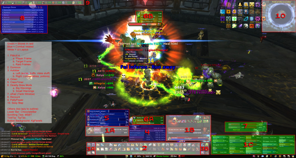
- PitBull Unit Frames 4.0: PitBull 4 is quite a bit nicer than 3. It’s not too different in terms of features available, but the setup is much much nicer. Basically, it allows you to create layout templates to apply to different unit frames, versus having to individually chance the player frame then the target frame then the raid frames, etc.Dominos + ButtonFacade: Out of all the bar mods that I have tried, Dominos was the easiest to setup and keybind. Though really, either Dominos or Bartender will suffice. ButtonFacade skins your buttons (works with autobar and dominos).
- Autobar: Automatically sorts specific buttons. Eliminates the tedium of repeatedly dragging healthstones and mage water to your action bars. Also works for class stances, blessings, auras and stuff like that.
- Omen Threat Meter: I’m winning at threat!
- ClassTimer: I use this to track short term buffs, certain abilities and stuff like that.
- Deadly Boss Mods: Boss mod of my choice. Nicer in my opinion than BigWigs.
- oRA2: It’s like CTRA, but not ass (and has no raid frames). Facilitates tank frames, item checks, zone checks and stuff like that.
- Recount: Performance meter. If you go to the deaths screen and click on a name, it will tell you what happened to them. Fairly useful in evaluating performance and diagnosing problems (and epeen stroking. Stroke stroke stroke).
- PallyPower: The de facto mod for tracking paladin buffs. Makes blessing assignments a hundred times easier. ARGH, Jesus if you are a paladin just install it so that I don’t have to get up in your junk about what buffs you will do.
- SexyMap: Makes the map really swank. But more importantly, it will hide minimap icons. I hate having an excess of minimap icons.
Other Addons
Visible addons that aren’t numbered in the raid screenshot.
- kgPanels: The black panel behind Dominos.
- Prat 3.0: Chat box mod. Class hilighting, logging, timestamping, etc.Chocolate Bar and Friends: It’s a Fubar/Titan replacement. FuBar2Broker will allow you to use your old Fubar plugins with this mod.
- FuBar2Broker
- Broker_repair
- Broker_Currency
- ChocolateBar Broker Display
- Volumizer
- Broker_CPU Memory
- FuBar_LootTypeFu
- MikScrollingBattleText: Scrolling combat text. It’s a bit lighter in weight than the other scrolling text mods. There was a very specific reason why I chose MSBT over Parrot, but I don’t recall what that reason was…
- TipTac: Displays a crapton of stuff on the tooltips
- Nameplates modifier: I like seeing percentage values on my nameplate health bars.
- OmniCC: Adds cooldown text to all of your buttons.


