Edit: Download link and more info has been posted here.
Except for a few things, I was fairly satisfied with my previous interface so KeiUI 4.0 really isn’t too different than KeiUI 3.2. Same goals as my previous UI incarnation:
- To retain functionality while reducing clutter, both in terms of appearance and addons used.
- To maximize screen visibility. I don’t like UI elements showing when they are not being used and I prefer to keep the center of the screen as clear as possible, barring scrolling text mods and stuff like that.
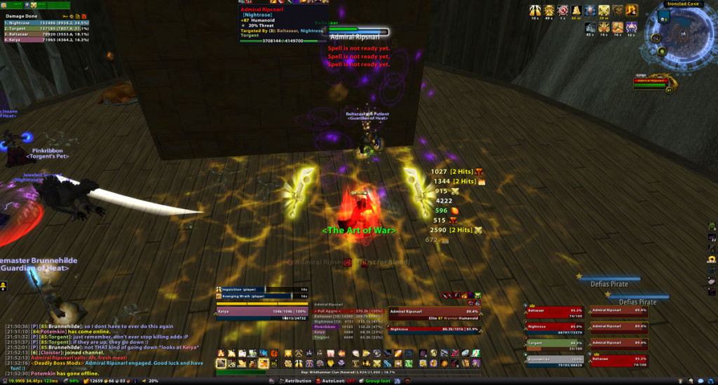
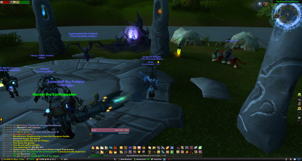
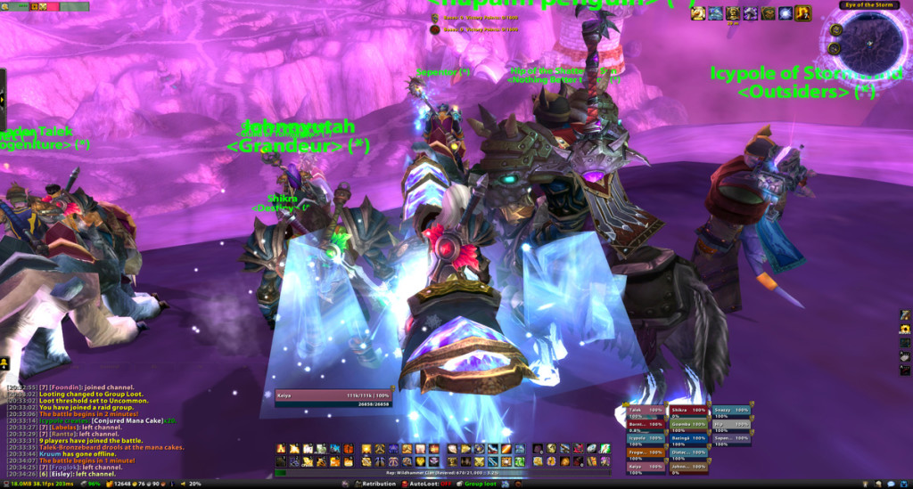
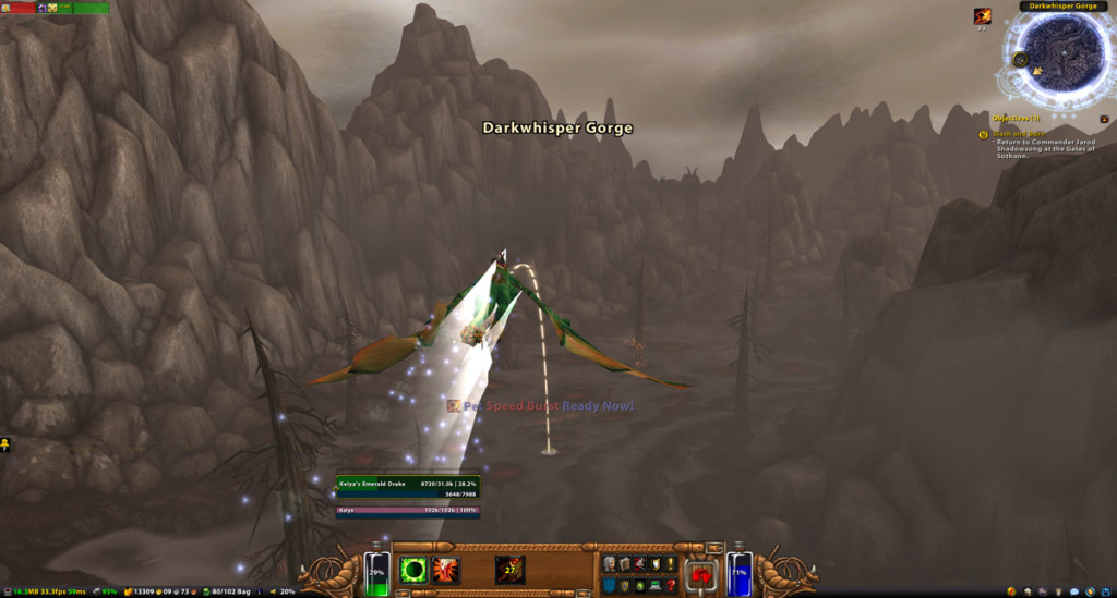
Ultra minimalistic DPS complications have an elegance that I love, but just won’t work for my purposes. Even though I don’t do so much raid healing, tanking or leading nowadays, I still feel like I need high information visibility in addition to my thousand keybindings. Everything, more or less, has its own place either along the bottom screen or shoved up at the top. Critical items like Omen, class spell timing bars, health bars and the like are condensed within a small area at the bottom center of the screen for easy visual access. Other times like the map, buffs and Recount are at the corners up top. When not in combat or not grouping, everything other than my player frame, the map and the hotbars will fade away.
Main changes: Dominos was dropped in favor or Bartender 4 because of the way Dominos would handle vehicle bar replacement. Since BT4 doesn’t allow you to customize the experience bar, I reinstalled XPBarNone, which automagically changes the display based on your level and what reputation is currently being grinded out. KGPanels was also dropped in favor of more visibility and reducing addon clutter. I really dislike interfaces with a giant opaque black bar obscuring the lower quarter of the screen so I wanted to shy away from that type of design as much as possible. At some point, I may even just fade everything except for the map when I am not in combat.
I dropped my other nameplate mod in favor of Tidy Plates, which looks quite a bit nicer. Autobar was also dropped in favor of just keybinding my Auras on the G13 and moving consumables elsewhere. I really liked the way Autobar condensed the different types of food and what not. It may get reinstalled when I start raiding. I am also using Holy Trinity to keep track of Holy Power (the three flat horizontal yellow bars right above my player frame). There’s a small holy power interface element that pops up in the middle of my screen whenever I am in combat. Not really sure where that is coming from or how to get rid of it :/.
My hotbars have been rearranged to correspond with how my Logitech G13 is laid out: Instead of having four 12×1 chunks arranged in a 2×2 configuration, I now have four 6×2 chunks arranged in a 4×1 configuration. It’s easier for me to keep track of how everything is keybound this way. The first chunk is bound to 1 through =, the second chunk is bound to shift + 1 through = and so forth. Will post my G13 layout later now that is has been “finalized.”
I’ve tried the new Blizzard raid interface, which is surprisingly nice though limited in terms of how you can configure it. Though I think the real problem is that I have been using a certain raid bar configuration for around 5 years or so. I love the way Grid and Perfect raid look in regards to how clean they are, but they just feel way too foreign. So I just stuck with Pitbull’s raid module which is fine.
Things that I may change: I am thinking of moving ClassTimer below my player frame, given that there is enough space. The only UI element located in that spot is a narrow bar that displays whenever I am in a vehicle or whenever a pet is out (not relevant to my paladin obviously). The vehicle thing isn’t an issue, since I’m using the Blizzard default vehicle frame (BT4 hides when I hop in). It’s not going to work out for my hunter though, since that is where my kitty’s healthbar is located.
Apologies for not responding to any UI inquiry emails received within the last couple of months by the way. Busy, yada yada. If anyone is interested, I can post this compilation somewhere. Though beware, it’s really only tested and designed for WoW in windowed mode at 1920×1080.


